 |
|  | ||
 |
|  | ||
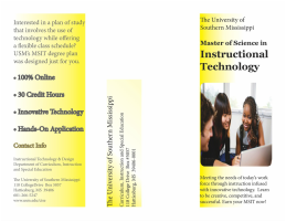
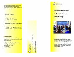
Designing a brochure that promoted the new MSIT degree program was one of the hardest assignments we have had to date. Just coming up with the overall look of the brochure was quite challenging and took me about 6 hours of back and forth changes before I was satisfied enough to start thinking about putting in the content items. Even as I was getting ready to upload the assignment into my Weebly site, I was still making slight adjustments to the brochure. Further feedback from my fellow classmates will definitely help me put the final touches on this brochure.
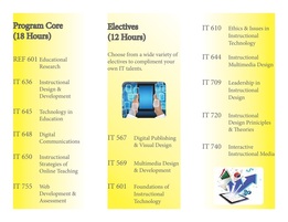
C.R.A.P. elements
Contrast is shown in the size of font as well as the applied black stroke around some of the text. The font that I chose to use did not have a “bold” option, so I decided to make this text stand out more by adding the stroke to the letters. I also have contrast in the black text against a gradient fill based on yellows. Repetition can be found in the type of font as well as the background color of my yellow gradient. Alignment is left centered throughout the entire brochure to create the visual of a clean line. The element of Proximity is found in the listing of the program classes. By grouping all of the core classes on one panel, they are easily distinguished from the listing of electives available to students. Contact information is also grouped for easier identification.
Revisions to brochure: I first needed to change the size of the font used in my brochure. It was recommended that font size should be no larger than 10 or 11 for the main text. My next step was to move the left-aligned text away from its current position that was crowding the border. It was recommended that I include course descriptions along with the listing of required classes and elective options. I used the clipping tool and "detect edges" to clean up the areas surrounding the two graphic images used on the inside of the brochure.
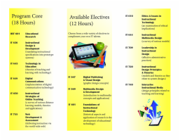