 |
| ||
 |
| ||
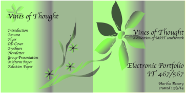
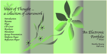
For this assignment, I wanted to mimic the look of this Weebly page as much as possible. Since it has a background of vines, I decided that I wanted to have some sort of earthy feel to my CD cover as well.
I first attempted to use the drawing tools to create a leaf for my vine. After several tries, I noticed that my leaf looked more like a petal. so by "copying" and "pasting" several more of these petals, I was able to create a flower by selecting individual petals and moving them into the proper positions. One I had them in place, I created flower's center. To move the entire flower, I held down the "shift" key and selected all of the petals and the center. I was able to use the "object/group" option after that. This allowed me to move the entire flower at one time. It was even easy to create smaller versions of this flower by having all of its parts grouped as one item.
C.R.A.P. elements:
For Contrast, I used a gradient background fill that varied from light green to a darkened shade. I also used contrasting font sizes. For Repetition, I only used one font style throughout the CD cover and placed three additional flowers on the back cover. My listing of CD contents is left Aligned, giving the back cover a nice clean look that balances well with the vine graphic on that side of the cover. The front cover text is right aligned as if to mirror the other side. My items are all listed in close Proximity to give the reader a quick way of finding anything included on the CD.
Revised cover:
A few suggestions were made to improve the look of my CD cover. The first thing I learned from listening to the feedback on other class members' projects was to change the "created by" date to just reflect the semester and year of this course. Another suggestion was to only include the class that I was actually enrolled in. In this case, it would be IT 567. Keeping just the "electronic portfolio" text on the front side would highlight that better.