 |
|  |
| ||||
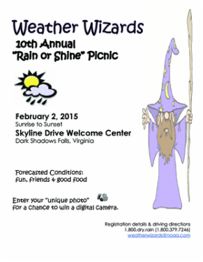
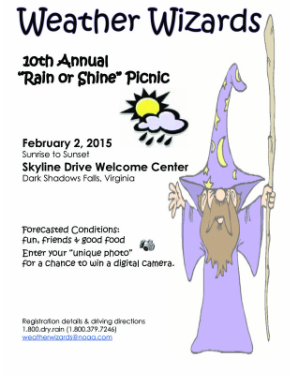
I really enjoyed putting together this flier. My interest in anything relating to weather made it easy to come up with the subject of my flier. "Weather Wizards" is a term that describes how most people feel about meteorologists. We often get blamed when weather forecasts are anything but 100% accurate. Do people really think we have some sort of magic power to conjure up good and bad weather?
C.R.A.P. components
Contrast
I included both regular and bolded text as well as different text styles to give the appearance of contrast. I chose to make the wizard graphic more transparent so that it would not overpower the text on the flier. I wanted the reader's eye to be drawn to the top left of the page.
Repetition
Repetition was achieved in using the same font at the top as at the bottom. This allowed me to connect the "fun" elements of the day's events. The colors used in both graphics were purple and yellow.
Alignment
Placing the wizard graphic along the right side created an invisible edge there. The main points of the flier are left justified and appear to be something the wizard has thrown onto the page.
Proximity
By grouping the date, time and location, the reader can easily find that information. The "forecasted conditions" and "unique photo" were also put in close proximity as they involve picnic specifics.
It took several attempts to get to a balance that made sense to me . Something always felt a little off and I'm hoping that my fellow classmates can provide some feedback to make it better.
Flier revisions:
I made the title bigger for a better contrast. All information was left justified to create the illusion of an invisible line down that side of the paper. I moved the two separate elements of picnic info closer together as they are related items.