|  |
| ||||||
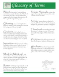
This was certainly a different type of exercise. I was used to just pulling up a lesson out of a folder and this one had us starting from scratch. It took me forever to decide on what layout to use for my listing of terms.
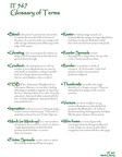
I decided to format it similar to the notes that I would create as a study guide for a test on these terms. Because I am a very visual learner, I knew that I would have to put some of text in color in order to make it stand out. I also wanted to highlight a few key words in each definition in order to learn them.
I finally decided to go with two main columns which were pretty easy to set up. I wanted to have a left-centered title at the top with some sort of gradient/shading. I used the corner adjuster (little yellow box) and gave them a rounded look. I liked the look of the green to yellow gradient swatch, so I went with that. I also carried that look through to the bottom of the page where I placed my name.
I chose a green color for my highlighted text as it was easy on the eyes in a cooling sort of way. I enjoyed working with the eye dropper and got to be really good at it as long as I remembered to "de-select all" every now and then so I wouldn't mess it up more than I needed too. I even got a little brave a added some diamond shapes to break it up visually.
This assignment wasn't bad once I knew the basic layout I wanted.
As far as my C.R.A.P. elements were concerned, I had Contrast covered by using a different color and size of font. Repetition is found where all of the terms are in the contrast color and by the bullets I used to separate them. Alignment is seen in the terms being left justified and the definitions being tabbed over. Proximity is illustrated by having the definitions close to the terms and by grouping the terms into two columns.
Revisions made:
It wasn't until we reviewed our glossaries in class that I saw a better way to incorporate the design elements of contrast, repetition, alignment and proximity. It was suggested that I enlarge my title area and use a contrasting background and text set up to make it look more professional. By simply repeating the size of font for my terms established repetition and eliminated the need for additional color. My alignment stayed at left justified as did my proximity of terms.
I wanted to add a visual element to my glossary page. I inserted a bonsai tree in my title bar to replace the diamond shapes. I also took the advice of my classmates by making the replicated tree in the white space at the end of the text quite transparent so that it would not overpower the page. I am happier with this second attempt at the glossary assignment and realize that I still have. a lot to learn about design.