Lesson 14
I think this lesson was the most fun out of the entire book! We were walked through the different steps necessary to convert a document for online use. This is important due to the different setting used in web versions of magazines.
The lesson started off with adding buttons, transitions and hyperlinks. These were pretty much just like creating a slide show in Power Point. We could identify what to use as the button and then where to direct the viewer once that particular button was clicked. Transitions are a great way to add animation to a document. Having different texts or objects appear on screen from a variety of angles gives an online document some life. Hyperlinks were set up that would take readers to other web-based articles for further information.
Next came the exporting choices. The fist new one for me was exporting it as Flash Player (SWF). I have heard of other students using this export option, but I have never actually used it. I like the look of the finished SWF product. The Adobe PDF (Interactive) was another greater export option. The lesson showed how to have several logos appear in a sequence or all at once. I preferred to have them all appear at one time, but from different directions.
Once we had experienced these new types of exports, we were then given the chance to upload a Flash video directly into the file. We used “file, place” to insert a short movie clip into the document. Then we were able to set the start time and have the image associated with that point in the video as the image to show on the page. It was fun to click through the different pages in the finished file and view all of the bells and whistles that were added during this lesson.
Critique Paper
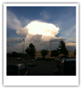
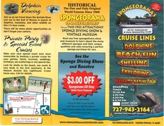
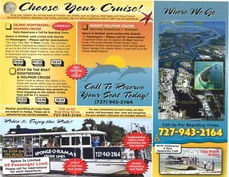
Graduate students were given an additional assignment of locating a business brochure to review for design flaws. I enjoyed the opportunity to critically review an actual business brochure. It was a great way to learn how to spot the basic design principles of C.R.A.P. when they are not being used properly and to make suggestions to improve the piece. I've attached the brochure images here as well as providing them on the last page of my critique. I hope you enjoy my write-up.
I think this lesson was the most fun out of the entire book! We were walked through the different steps necessary to convert a document for online use. This is important due to the different setting used in web versions of magazines.
The lesson started off with adding buttons, transitions and hyperlinks. These were pretty much just like creating a slide show in Power Point. We could identify what to use as the button and then where to direct the viewer once that particular button was clicked. Transitions are a great way to add animation to a document. Having different texts or objects appear on screen from a variety of angles gives an online document some life. Hyperlinks were set up that would take readers to other web-based articles for further information.
Next came the exporting choices. The fist new one for me was exporting it as Flash Player (SWF). I have heard of other students using this export option, but I have never actually used it. I like the look of the finished SWF product. The Adobe PDF (Interactive) was another greater export option. The lesson showed how to have several logos appear in a sequence or all at once. I preferred to have them all appear at one time, but from different directions.
Once we had experienced these new types of exports, we were then given the chance to upload a Flash video directly into the file. We used “file, place” to insert a short movie clip into the document. Then we were able to set the start time and have the image associated with that point in the video as the image to show on the page. It was fun to click through the different pages in the finished file and view all of the bells and whistles that were added during this lesson.
Critique Paper
Graduate students were given an additional assignment of locating a business brochure to review for design flaws. I enjoyed the opportunity to critically review an actual business brochure. It was a great way to learn how to spot the basic design principles of C.R.A.P. when they are not being used properly and to make suggestions to improve the piece. I've attached the brochure images here as well as providing them on the last page of my critique. I hope you enjoy my write-up.
| Lesson 14 |
| critique.docx |
 |  |