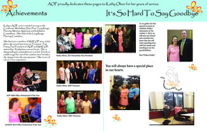
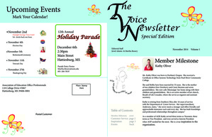
Setting up this newsletter ended up being very time consuming. It was hard to decide on an overall style and color. Jewel and I worked on this together and came up with the idea of dedicating the issue to a member of the USM Association of Office Professionals (AOP) who was retiring after 16 + years of working here on campus. We wanted to include photos from some of the awards that Kathy had earned while serving as an AOP officer. Our newsletter includes a special 2 page spread devoted to Kathy's accomplishments.
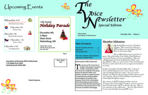
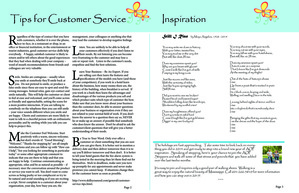
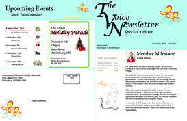
Formatting involved the use of many layers to better handle numerous graphics. Our newsletter also contains banners, graphics and even a small flier about an upcoming holiday parade. We used the design element of Contrast by using background fills for the banners. Repetition is shown in the flower graphic that is used throughout the newsletter. The majority of the Alignment is left-aligned with only a few elements centered on the pages for dramatic effect. The design element of Proximity was used by placing text close to the photos being described.
Formatting involved the use of many layers to better handle numerous graphics. Our newsletter also contains banners, graphics and even a small flier about an upcoming holiday parade. We used the design element of Contrast by using background fills for the banners. Repetition is shown in the flower graphic that is used throughout the newsletter. The majority of the Alignment is left-aligned with only a few elements centered on the pages for dramatic effect. The design element of Proximity was used by placing text close to the photos being described.
 |
| ||
| revised_newsletter.pdf |
 |  |
| additional_revisions.pdf |
 |  |
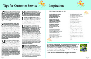
Revised Newsletter:
The fonts were changed to be more consistent and readable. The extra spread was eliminated from our submission. A few minor tweaks were made to the list of event dates and the page numbers.
Additional Revisions:
This included moving the table of contents back up to the top of the left column on the cover and moving the angel graphic to the bottom.